No need to shout!
“The less content you use the greater the engagement and impact attributes of the design”

Ever noticed the louder someone talks the less likely you are to listen? The bigger the noise the smaller your attention span? Well, it is the same with visual perception. The brighter the light the less able you are to see.
The use of negative space (sometimes called white space) in design communications is vital to avoiding clutter and getting impact and style into the work. When designing you are walking a tightrope between what is, and what isn’t, necessary to include and this expertise takes a long time for designers to acquire. A delicate process that, when successfully achieved, delivers an engaging message with clarity, dynamism and elegance.
With the attention span of an audience getting shorter, in both online and in print environments, it is getting more and more important for clients and their designers to reduce and simplify their content and visual presentation to ensure their message gets delivered effectively in the shortest possible time.
This approach is broadly called minimalism. Minimalism is a way of thinking and application that removes any superfluous elements in a design to leave an essential core message that is independent of distraction. It’s more than a passing trend or fashion, it has been around as long as man has put a mammoth hair brush covered in coloured pigment to a cave wall!
The minimalist approach: some tips for graphic designers
- Consider the audience: As always, your first consideration should be your audience: a minimalist approach to a project does not mean creating a conundrum. You still have to communicate your proposition so don’t make the mistake of leaving out necessary information. When used correctly, minimalist techniques enhance the message and do not confuse and alienate the audience. Like those actors that mumble their lines on-screen the method can obscure the message. Incoherence is not an option, embrace clarity, not confusion.
- Employ colour: Although monochrome designs have their place in situations that require a certain mood and style, it is not necessary to avoid colour completely in a minimalist design. It is however important not to overuse it. Use as only as much colour as the design requires and work and, if possible, with a restricted palette. Sometimes it is good practice to limit your palette to 2/3 colours and, worked with an overall monochrome theme, this enables heightened impact by using the colours sparingly as highlights juxtaposed with the overall monochrome effect.
- ‘Less is more’: The less content you use the greater the engagement and impact attributes of the design. Only use the essential elements in a design where the final effect is greater than the sum of its parts. Get rid of any ‘clutter’ that isn’t critical to the function or content of your product. The method is to continue to reduce all non-essential information and are left with the core concept. Find the limit but do not cross it to the point where it becomes ineffective.
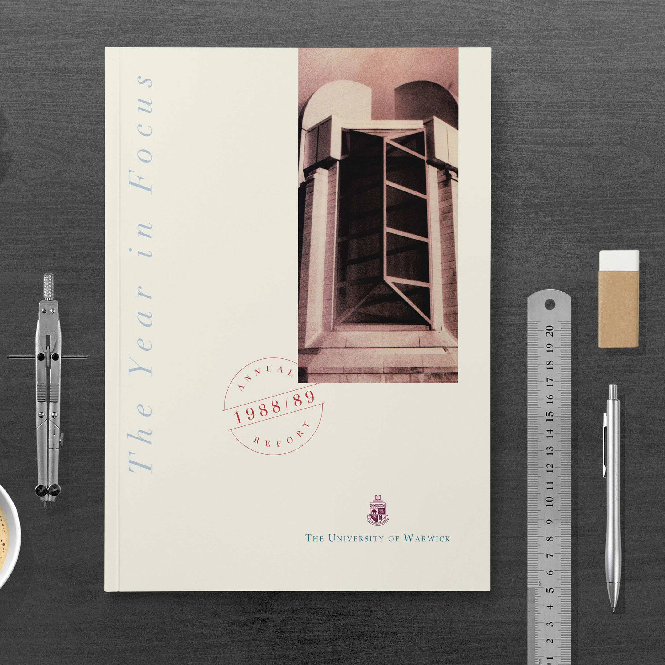
- Negative space: Be brave. Although you also shouldn’t focus on leaving negative (white) space for the sake of it, the more courageous you can be, the greater the style and impact of the final design. Take a look at the design below which was produced to illustrate the difference between a minimalist approach and a more cluttered effect. Now make your judgement of which of the two has the greater elegance, legibility and accessibility.

- Typography: Do not sacrifice legibility in the search for minimalism. Always consider the fact that the whole point of a minimalist design is to enable effective communication. Readability and legibility are paramount in the typography in your designs. Whilst designers love minimalist type weights and sizes I often see examples where the legibility has been lost by taking the point size down too far. And this is not just some moaning old git repeating the client’s mantra of “make the type bigger I can’t read it!” Apparently with the right glasses I have 20/20 vision so if I can’t read it…
- Layout: It is important with minimalist layouts to follow a grid pattern carefully. The fathers of the original minimalist movement utilised simple grid structures in their work as grids are a good way of positioning items so as to be easy and simple to view.
- Concept: The key to a successful minimalist design is to have a strong concept. That way the treatment becomes secondary to the idea. A minimalist design allows a strong message to shine through which is why you will usually find the best ideas are usually supported by a minimalist layout.
Whilst minimalism may seem like a design style that you pick up and drop like a hat it is, in fact, the case that the minimalist thought process should be a designer’s modus operandi in every project that he undertakes. The mantra when introducing an element or content into a project should be “is this necessary, does this add value?” That is the skill and what makes effective minimalist design difficult to achieve. Either way, the simplicity and clarity of message that is inherent in work as far back as the prehistoric cave paintings of Lascaux, through to early Japanese calligraphy and engraving and on to Soviet propaganda posters of the 20th century, is a challenge and, if successful, a pleasure for designers to emulate.
As a final aside I have just remembered many years ago a client commenting on the minimal design style I was using for his advertising campaign. “No, no, NO, he said looking at the designs – what is all this blank space about? The pages for these magazines have cost me a fortune. We need to fill every available bit of space with content otherwise I have paid good money for sections of empty paper.” Needless to say his was a long and difficult conversion to the minimalist cause. :–)
Definition: Negative space, in art, is the space around and between the subject(s) of an image. Negative space may be most evident when the space around a subject, not the subject itself, forms an interesting or artistically relevant shape, and such space occasionally is used to artistic effect as the “real” subject of an image.
This article was written by Luke Dibbens at Mustard Design – please feel free to get in contact
Blog.


Feel free to get in contact to discuss any of the topics included in our blogs
By submitting this form you agree to transmit your name and email to us for the purpose of your enquiry.
To find out about what information we hold about you and how we store and manage it please read our privacy policy.
Free brand evaluation
Professional recognition includes:
City of London Stockbroker’s Guild Best UK Annual Report
Mercedes Benz International Property Marketing Gold Award
Printweek UK Print Awards Silver Category
Shine Media Awards Winner
Enquiries: info@mustardhot.com
© 2020 Mustard Design
